I’ve tweaked the Squash Source site design. I’m naming this update “Get to the Point!”
Previously, if you visited Squash Source on your phone, you’d see this:
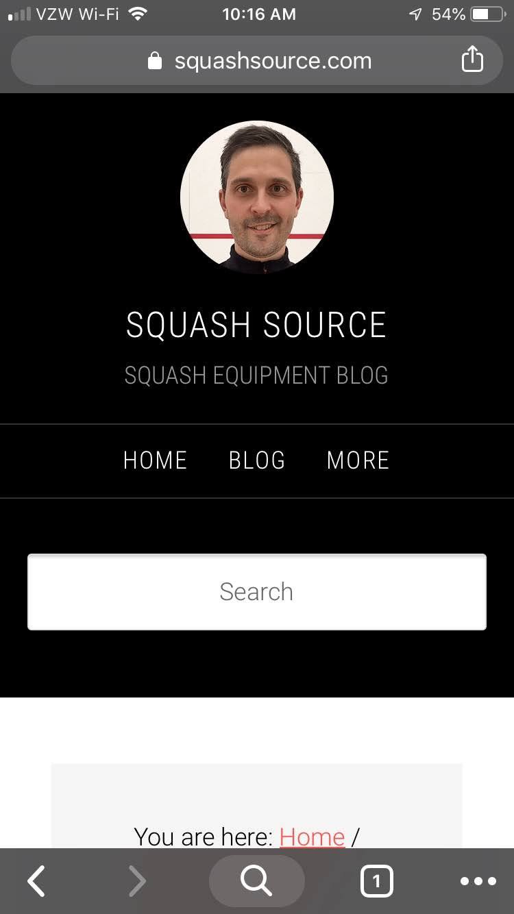
In other words, you’d see MY FACE, plus a bunch of non-critical information. You can’t even tell what page you’re on without scrolling down!
Sometimes, I’ll go to a squash tournament and someone will recognize MY FACE, even if they can’t remember from where. And I have to admit that is pretty cool. But it’s really bad for the usability of this site.
The new version of the site looks more like this:
Better, yeah?
I still have some changes to make — for example, I need to add back a search box, and I need to find a place for MY FACE somewhere — but I couldn’t wait to release this change, so here you go. It might take a few hours before you see the new design, because your browser likes to cache stuff.
John says
()
Hi Pierre,
You look more fit (in the picture).
KR.
John